And that’s part of the reason why Apple’s “me too”s end up feeling like “me-first”s. In the age of digital, execution is staggeringly important, and there isn’t a single company in existence that can pull off polish and simplicity like Apple. While other companies struggle just to get all of their devices and services talking to one another, Tim Cook and friends are worrying over the details that actually make consumers pay attention. The products don’t just work the way they should; they feel the way they should. Reducing friction, even a single click, can change the way a user perceives an entire product. […] [Emphasis mine]
That’s partly Apple’s magic show: being able to blend the familiar, the known, and the obvious with something (even a little bit) totally new. The company’s senior vice-president of marketing, Phil Schiller, told Businessweek “You can’t just say, ‘Here it is. It does the same thing 5 percent better than last year.’ Nobody cares.” But that five per cent is often the difference between making something that people talk about, and making something they forget. That five per cent is where Apple lives.
Nike Flyease: Sneaker Technology for People with Disabilities →
Love product design stories like this.
When you start looking at a problem and it seems really simple with all these simple solutions, you don't really understand the complexity of the problem. And your solutions are way too oversimplified, and they don't work.
Then you get into the problem, and you see it's really complicated. And you come up with all these convoluted solutions. That's the sort of middle, and that's where most people stop, and the solutions tend to work for a while.
But the really great person will keep on going and find the key, underlying principle of the problem. And come up with a beautiful elegant solution that works.
—Steve Jobs
People Don't Want Something New, They Want the Familiar Done Differently →
Then came the California Roll. While the origin of the famous maki is still contested, its impact is undeniable. The California Roll was made in the USA by combining familiar ingredients in a new way. Rice, avocado, cucumber, sesame seeds, and crab meat — the only ingredient unfamiliar to the average American palate was the barely visible sliver of nori seaweed holding it all together.
The California Roll provided a gateway to discover Japanese cuisine and demand exploded. Over the next few decades sushi restaurants, which were once confined to large coastal cities and almost exclusively served Japanese clientele, suddenly went mainstream. Today, sushi is served in small rural towns, airports, strip malls, and stocked in the deli section of local supermarkets. Americans now consume $2.25 billion of sushi annually.
The lesson of the California Roll is simple — people don’t want something truly new, they want the familiar done differently. Interestingly, this lesson applies just as much to the spread of innovation as it does to tastes in food.
Another great example of innovation being more about execution, not the idea.
Kevin Rose on Focus →
Kevin Rose reiterating my favorite advice.

Why Android Wear 1.0 Will Flop →
Here are the Apple Watch dimensions:
- 38 mm model: 38.6 x 33.3 x 10.5 mm
- 42 mm model: 42 x 35.9 x 10.5 mm
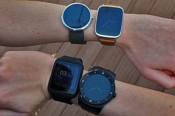
And here are some of the dimensions of popular Android Wear devices:
- Asus ZenWatch: 51 x 39.9 x 7.9 ~ 9.4 mm
- LG G Watch R: 53.6 x 46.4 x 9.7 mm
- Moto 360: 46 x 46 x 11.5 mm
- LG G Watch: 46.5 x 37.9 x 9.95 mm
- Sony SmartWatch 3: 51 x 36 x 10 mm
- Samsung Gear Live: 56.4 x 37.9 x 8.9 mm
- Huawei Watch: 42 x 42 x 11.3 mm
Since we're just beginning the Smartwatch 2.0 era and we're waiting to see if smartwatches will gain traction with the mainstream consumer, there are two important questions to ask:
- How many women will wear a smartwatch?
- How many women will pay to wear a smartwatch?
If the answer to the first question isn't favorable (at least a few million), there's no point in even asking about the second one.
So when I look at the dimensions of these Android Wear 1.0 watches, the question comes up: how many women will wear a masculine-looking gadget on their wrist that is over 46 mm?
Apple, on the other hand, has designed a watch in a size suitable for women. Now, I'm not saying that all women will buy an Apple Watch, but I bet there will be a hell of a lot more women in the Apple Watch corner than the Android Wear corner.
Communication by Touch →
This. Exactly this. But built into the Apple Watch.
When Apple first announced communication as one of Apple Watch's three tent pole features, it sounded gimmicky to me. But the more I thought about it, the more I saw beauty in how well it humanizes technology.
This isn't a feature that will wow you when you read about it. This isn't something that will jump out at you when you read tech specs or feature lists. Rather, this is the kind of feature that you may very well fall in love with once you actually experience it. This is about making an emotional connection.

Why the Amazon Fire Phone was Dead on Arrival →
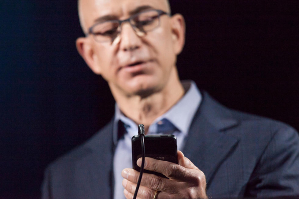
And team members simply could not imagine truly useful applications for Dynamic Perspective. As far as anyone could tell, Bezos was in search of the Fire Phone’s version of Siri, a signature feature that could make the device a blockbuster. But what was the point, they wondered, beyond some fun gaming interactions and flashy 3-D lock screens. "In meetings, all Jeff talked about was, ‘3-D, 3-D, 3-D!’ He had this childlike excitement about the feature and no one could understand why," recalls a former engineering head who worked solely on Dynamic Perspective for years. "We poured surreal amounts of money into it, yet we all thought it had no value for the customer, which was the biggest irony. Whenever anyone asked why we were doing this, the answer was, ‘Because Jeff wants it.’ No one thought the feature justified the cost to the project. No one. Absolutely no one."
This is the exact type of client I hate working with. The type that fixates on specific features instead of focusing on building solutions or achieving goals.
Moto 360 Ad: Vibration Sound is a Feature? →
Out of all the first-gen Android Wear devices, I like the Moto 360 the best because it actually looks like a watch (albeit a big, masculine watch that looks good on big guys like me but not for most mainstream consumers). But what I find interesting about Motorola's two ads is how they're promoting the not-so-silent vibration mode as a marketable feature.
I think a vibration sound is annoying. Just ask my puppy who freaks out every time he hears my Pebble vibrate.
Apple Watch's "Taptic Engine" is completely silent and according to bloggers with first-hand experience, it literally feels like someone is tapping you.

How to Not Design a Smartwatch →
In the next decade or so, I believe the smartwatch will replace the smartphone (and even the PC) for most of our everyday tasks. This vision, however, will require a total reimagination of the user interface; specifically, inputting data.
Samsung understands the vision. Unfortunately, they have no idea how to get there.
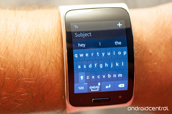
What they've done here with the Gear S is taken a smartphone and shrank it down to the size of a wristwatch. Who cares if a wrist-size keyboard won't work in the real world. A smartphone on a wrist sounds pretty cool, right? Keyboards worked on smartphones so obviously they'll work on the wrist, right? The Apple Watch won't have a keyboard but the Gear S does, so that makes the Gear S superior, right?
This is a perfect example of what happens when companies just say "yes" without understanding "why".